Category Archives: Rendering, Texturing and Lighting

Dynamics inspiration

Standard

Inspiration and development of Dynamic effect


VFX has a broad variety of simulations and effects that create a montage and style for films. They encompass and bring films to life adding depth, excitement and entertainment. Technology and software have reached new heights where reality can be mimicked to heighten and engage viewers to a new level. Ndynamics has contributed to visual feasts and breakthroughs in the last few years, as many unachievable effects are now in our fingertips.

Smoke effects have intrigued and increased curiosity for many artists and this report will explore an inspiration and goal for a smoke particle effect. By nature smoke is subtle and a very interesting effect to generate. The main inspiration is a hookah bong which is the centre-piece of a personal project.

Scientific qualities if smoke describe it as “ a collection of tiny solid, liquid and gas particles. Although smoke can contain hundreds of different chemicals and fumes, visible smoke is mostly carbon (soot), tar, oils and ash.” Smoke occurs when there is incomplete combustion (not enough oxygen to burn the fuel completely). When creating smoke as an effect, it is important to keep such facts in mind as it can mould one’s understanding of the phenomena. (Govt, 2009)

Smoke has specific characteristic such as a vapor like quality. It is also hazy and misty in nature. The gaseous trait of smoke is something to pay attention to as this is what will create majority of the simulation. There are varieties in smoke such as; combustion smoke, cigarette smoke, magic smoke, explosion aftermath smoke and fog to an extent. In essence the aim would be to create a “smoke bomb effect”.

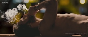
These were some inspirations and ideas that could assist in brining this simulation to life! This bollywood film had some great examples of realistic smoke and how effective it is in films. The idea would be to replicate this effect. 

smoke_01 smoke_02 smoke_03 smoke_05 smoke_06 smoke_bomb 


The smoke bomb videos are also a great source of inspiration, especially the colours that arise from them. The pressure is something to pay attention to with the smoke bombs. 


Lighting scenario

Standard

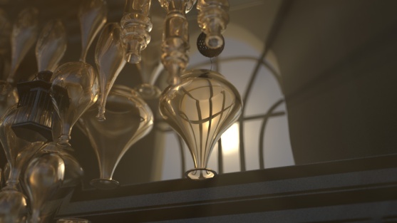
For this lighting assessment, I wanted to create something that would suit the mood and atmosphere I was trying to emulate in the room. I wanted a dusty and “used” look to the whole render. I decided to do an evening scene, to show off the lighting and all the aspects of the room such as the glass bottles,the stairs and the windows. I wanted volume scattering to create a certain amount of mood in the room. The scattering also acted like god rays, bringing the room to life.
I had two main lights in the room. One acted as a main source flooding through the rounded window and the other was light streaming in from the larger french window. The main light source was the centre piece of the room and gave it character. The secondary light source gave it another dynamic and realistically there would be some amount of light coming in through any window. I also added a physical sun and sky. The two lights used were area lights.
I felt the shadows worked quite well and there was a good balance between light and darkness in the room. I did want to create mystery and intrigue in the room which was possible due to the feature light from the round window. I also used the kelvin temperature in the Arnold section to get a realistic and accurate result in the lighting. This gave a clear idea of the final look I wanted to achieve.
These were some of the references I used to guide me through the exercise.

golden_hour_01 golden_hour_02


legend of korraThe last image really spoke to me and related to my style of lighting thoroughly. I wanted to achieve this look. These were the two lighting scenes, I produced.

dof_render_01 dof_render_04


Week 5 waterfall simulation

Standard

For this week we were given the exercise to create  a waterfall particle simulation with everything we had learnt about goal instancing and applying it to a scene where geometry is uneven and you have cars or objects passing through them.

For this I dint use an instancer replacement. I wanted to use the particles themselves to make it look more like water. I first selected my geometry and then went to emit from object. Then I selected my particle one and then my geometry and went to goal. This action made sure that the particles would follow the geometry and not in a flat line.

As in class the particles were following this pattern when you played through the simulation. I wanted a random effect so that it looked like the particles were flowing. I added some extra attributes that we added in class, goalU, goalV, parentU, parentV, randSpeed and randTurn. These would define the parameters of the particle simulation. These were the settings I used–>

set_2

I realised that the particles were only covering a small area through the simulation, but when I started tweaking the settings I realised that it had something tp do with my randTurn attribute and how long it’s meant to last. I changed the time to 0.05 which made a huge difference in the speed and the amount that the particles fell at.

set_4

I used a gravity field to make the simulation look realistic and natural. I had the set the magnitude upto 200 which seemed to work pretty well. I also used a turbulence field to add randomness and sporadic movements through the simulation. I had the magnitude set upto 300 which had tamed the amount of randomness through the simulation. I also used a turbulence field to make the simulation look random and naturalistic.

I also had to change the lifespan of the particles to lifespanPP in order to see whether the expression worked properly.  Here’s the video–> https://www.youtube.com/watch?v=AddNctNKv8Q&feature=youtu.be

some research material->

water_falll


water_fall_2

Week 3- Biplane particle simulations

Standard

For this week, we had to create a squadron of exactly 72 planes, which were meant to look random and travelling in their own paths over 100 frames.

I decided to follow the examples we were shown in class with the snapshot groups. This was more tricky as there was animation on the propeller and the plane was divided into a group of 2. I selected the planes and propellers individually and created the snapshot. These were the setting I used–> I also changed the max count to 72, to make sure there were only 72 particles coming out of the simulation.

To make the simulation random I wanted to create a turbulence field which reflected the squadron effect of the planes flying past. I also used a drag field, to test the limitations and what I can achieve with that.

These were some the settings I used–>

set_1

snap_shot

This is the final video–> http://www.youtube.com/watch?v=3QvLbh_2ht0

I did have some trouble with jumpiness and disturbances through the simulation and couldn’t identify the problem.

Week 2- Creating rain particles

Standard

For the exercise this week, we had to replicate the rain particles that we created in class and compare scale issues/sizes. We had to replicate the rain rig to be 1/10th of the size we used in class.

To start with I decided to calculate the scale of my planes to 80, as the initial scale was 800. This would have a big impact on the area that the rain would cover. This is an example of the settings.

settings_001

I had basically just followed the steps that we did in class to set-up the rain, but when it came to attributes such as the rate of the emitter I changed it to 2000 instead of 20,000 after the calculations.

I also paid close attention to the magnitude attributes for my turbulence and gravity fields. The magnitude controls the strength of the field which inturn affects how much rain falls in a particular region according to it’s scale. I changed the magnitude values of gravity to 98 from 980 and the turbulence field from 250 to 25.

These were my turbulence field settings: Some of the tweaks made a huge difference after I calculated 1/10th of the size. chair_003Here’s the link to the video–> https://www.youtube.com/watch?v=SpPJdJcMY4I&feature=youtu.be

  • The advantages of creating a rain scene with such a scale would be that it is easy to control and monitor. You could easily tweak something, without having to wait while the frames render.
  • It conserves energy and time, so I guess more practical.
  • If you had other particle simulations, it would make more sense to use something of this scale as you could achieve faster results, but maybe not higher quality.

Advantages of using the scale used in class would be that:

  • It is more accurate and mimics reality if that is the effect you wanted to achieve.
  • The fields would apply more and work better as they are designed to work for realistic simulations
  • You could enhance and detail the simulation by using real-life references and scales.

ld use both the sales depending oI woun what I am trying to achieve and how much detail I want in the rain simulation, realistic or stylistic.


Critical reflection

Standard

Overall, I found this project to be quite ‘fruitful’ in terms of knowledge and artistic ability in Maya. It made me analyze, ponder and critique every move I made or every option I changed. I realized how much work goes into post production, rendering and lighting and one of the most important aspects that struck me was the amount of references and real-life texturing/lighting scenarios that are used to assist and guide lighting artists in the virtual world.

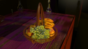
When I look back on my project, there are plenty of things that I could have improved on and done differently. I think one of the aspects I would change would be allocating more time to lighting and focusing on accurate and realistic references of lighting. “Half of good lighting is texturing and half of good texturing is lighting”- Lee Lanier. I read this quote while looking at a texturing for 3D book and completely agree with the essence of it. Lighting is as important as texturing, but both of them must work in conjunction with each other. I thought I could have improved my work in terms of both components and achieving finer details of lighting. “Even a beautifully texturing job can be ruined by poor lighting”- Lee Lanier. I found this especially relevant when I hadn’t lit my scene well, even though I had textured my fruit well. Looking back I would have lit my scene first and then textured it as I would have been more guided and directed in the way I worked and knew which direction/goal I was heading towards.” It’s important to remember that the ultimate goal of rendering a computer-generated image is to create realistic, finished surfaces by simulating the behavior of light in the real world.”- Boaz Livny. This particular quite resonated in my mind about the entire project in general and will help my future endeavors while lighting and texturing.

With texturing, I hoped to have observed more and understood the different components about what made the texture more. I wanted to explore the finer details of each texture more. “Texturing is the re-creation of specific surface qualities through the application of shaders, procedural textures and bitmap textures- is dependent on the understanding of light and how it interacts with various real world materials”- Lee Lanier. This quote explores the fundamental ideas and desires I had in mind for my textures. Even though I broke down my textural components, I would have liked to push them further. ” Hence, the goal of texturing and lighting a product is to present it aesthetically so that a buyer might desire it”- Lee Lanier. This was essentially my entire aim for both my lighting and texturing and I think I achieved it half-heartedly. I would have liked to push he boundaries of texturing a bit more and dapple into the depths of what makes up a material object and why it looks the way it looks. “The choice of a rendering method depends on the final look you want”- Dairush Derakshani

References: Lee Lanier, Maya studio projects, texturing and lighting, publishers: John Wiley and Sons 2011

Boaz Livny, Mental Ray for Maya, 3ds Max and XSI, publishers: Wiley Publishing 2007

Dairush Derakshani, Introducing Autodesk Maya 2014, publishers: Wiley publishing.


The fruit bowl progress.

Standard

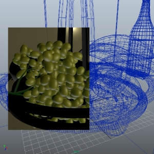
First progress stage: My first plan of attack for the fruit bowl project was to get my textures of all the fruits and set-up the scene. When I first began texturing I wasn’t observing the actual elements and composition of the fruit and textures. So the very first thing I did was break down the elements and aspects of the fruit bowl. I didn’t want to add any indirect lighting in the beginning, as I wanted to go through a step-by-setp process set-up. These were some of the images from my very fist renders.

bowl bowl_1 grape_proto grpae_one

Strengths: I was starting to get my textures looking realistic and accurate. I found that after I broke down the different elements I was able to easily understand and problem solve texturing pipelines. I found that the composition was coming together and the placement was quite good.

Weaknesses : There was still quite a bit of work to do in terms of getting the textures looking accurate and real. The lighitng needed quite a bit of work and the textures in general were looking quite flat. The bottle needed a lot more work in terms of being very flat and unrealistic. It wasn’t looking like the way it should and I started playing around with the caustics but I wasn’t quite hitting the mark.

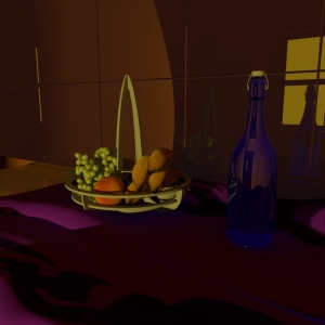
Second progress stage: During this stage, I was mainly focused on nailing the textures and the lighting as well. I went back and added more detail or sometimes reduced detail of the textures on mudbox. I realised that my textures weren’t quite working as well as I wanted them to, in terms of being accurate. I referred to my photos a lot more and the renders were coming together. I still had to work on my composition.

 render_scene_01 render_scene_02

Strengths: My textures at this stage were looking quite realistic and accurate. I think my basic lighting set-up was on the right path but I thought I could achieve more. I liked my colour scheme and the colour of my lights.

Weaknesses: There was still quite a bit of work to to be done and more in terms of my lighting set-up and refelctions. The light was looking quite flat and this was before I had physical sun and sky turned on. I was using an area light as the sun and a spot light as the fill light. The bottle had definately needed more work and I was contemplating changing the colour of the bottle to a transparent material. The cloth I was using was just a reference and I decided to go into mudbox and texture the bench-top. I definately needed more indirect lighting and light bounce in the scene. I was quite worried about my caustics and I decided that I would focus on my lighting first. The bottle itself looked flat and unrealisic and it was absorbing more light than reflecting it.

Third stage progress: At this stage I was focused very much on the lighting and composition of the scene. I started playing around with the caustic light and my physical sun and sky. I progressed the most at this stage in terms of getting everything together and composing the scene well. I changed my lighting set-up based on this image for my photorealistic lighting:

_IGP0062

I positioned my lights in a way that suited and matched this light set-up. I had an area light at the back, which would give the soft light effect seen in the image. I had a spot light acting as a rim light and used a spot light as I wanted the light to only effect certain parts of the fruit bowl as seen in this image. My physical sun was acting as the main source of light. I also got rid of the silk cloth I was using and created a purple wood bench-top. I created the texture on mud-box and also painted it on mud-box.

Strengths: I found that during this stage my lighting set-up had improved a great amount, as I was following an example and understanding the way light worked more. I had started altering and enhancing some aspects of my bottle too. I decided that I would change the color of it, to a transparent color rather than the blue, as there were some aspects that just weren’t working quite well. I also enhanced some of my texture, to make them more realistic and match the accuracy of the fruit textures seen in the images. My lighting was a warm tungsten light to match the lighting set-up seen above.

Weaknesses: I wanted to achieve more with my lighting and my textures. I hadn’t quite figured out what I wanted to do with my artificial lighting set-up and was struggling with getting it right. As until this point, I had both final gathering and global illumination turned on and realized that my renders were far too blown and washed out. The GI was a waste of energy as it scattered light across the room and was unnecessary. Final gathering was the option I chose as it made more sense to calculate the amount of rays through the render camera and focus only on that spot, rather than the whole room. I wanted to focus on my lighting and the reality of the textures.

Lighting_scenario_001 Lighting_scenario_002 Lighting_scenario_003 Lighting_scenario_004 render_007 Render_scene_003

Texturing for the fruit bowl project

Standard

Introduction: In terms of my general workflow for the fuit bowl project, I tried to make sure I used real-life references and keep the textures and swatches as accurate to reality as posssible. I also broke down the different aspects I wanted to focus on for example the diffuse, bump nodes, specular e.t.c. I used a combination of programs for example, mudbox, photoshop and Maya. I focused mainly on mudbox for the majority of the project. For example for the normal maps, I used mudbox and made at least two maps for the same texture.

I wanted to focus on a maximum of three photo references and I decided to break down the different elements of the textures. These were the references I used:

_IGP0051 _IGP0060 _IGP0063

The apple: With the Apple texture I didn’t want much of a bump, but I wanted to build up the diffuse paint layers of the texture and get a soft and naturalistic effect. I painted this on mudbox and also created the normal map on mudbox. This is how I broke it down:

Main diffuse layer: The main and distinct hue of the apple.

Secondary diffuse layer: The wear off colour on the surface of the apple, for example it has yellow-green swatches

Imperfections and spots layer: Basically painted the lines seen on the surface of the apple, scracthes and any other spots.

Specular layer: I bascially defined how shiny the surface of the apple was, and which areas it would affect the apple.

Bump maps layer: On the highest subdivion layer on mudbox, I added in the bumps and other surface flaws that affected the actual model. I didn’t add too much detail on the bumps of the apple, as I didnt feel the need to over-exaggerate the surface. I mainly focused on the crater on the apple and the subtle blotchy effect that was seen.

This was a combination of my diffuse map of the apple: apple_texture

For the banana, I basically went through the same process, as I broke down the different elements that contributed to the texture of the texture and I noticed there were a lot more blemishes that were quite visible and obvious, it had a lot more spots as well and not much secondary diffuse. The surface was not extremely glossy, but it did have a bit of a glossy element. It also had a slight specularity.

Main diffuse layer: The main colour of the banana, which was a lime yellow.

Secondary diffuse layer: The banana did have a bit of burn near the stalk and the end of the banana. It also had a bit of secondary colour, but it wasnt very obvious  

Imperfection and spots layer: There were a few imperfections on the banana and they were bruise like, I did make my own stencil for this and applied it while I made my normal map.

Specular layer: There definately was an element of specularity in the banana, but it wasn’t very prevelant.

Bump maps layer : With the bump maps, I made sure I did them on mudbox and focused on the bruises, I used a stencil for this.

This was an example of the banana diffuse texture:

 banana_text

Orange: For the orange I noticed that the surface was definately uneven and it had quite a few bumps, almost like pores. There was a big crater on the stalk of the orange. The surface was quite glossy and had a specular element to the surface as well. The orange had a skin like texture to it and I tried to incorporate this using stencils that I had created. I created the orange diffuse in photoshop.

Main diffuse layer : The main colour of the orange was a dark burnt orange.

Secondary diffuse: The orange had a lighter yellow colour showing through which didn’t take over the entire orange, but it had a subtle tinge.

Imperfection and spots: The orange itself didn’t have any major imperfections, it only had the pore surface which I had created in its normal map. The crater was another imperfection that I had textured and also created in the normal map.

Specular layer: The orange did have a specularity element to it as the surface was quite glossy. I created this in mudbox.

Bumps layer: I created a normal map for this on mudbox and made sure I incorporated my personal stencils to create the pore surface of the orange.

Pear: This was an interesting surface to work with, as there were a lot of elements to work with. The surface was not very glossy, but it did have a specular element to it. It did have a few imperfections, almost spot like.

Main diffuse layer: I created the maib colour which was a lime green and had a yellow tinge to it.

Secondary diffuse: This was just another addition to the main diffuse layer and I used a lighter green for this.

Imperfections and spots: I created another stencil for the spots of the pear and it was replicating the imperfections seen on the surface of the pear.

Specular layer: There wasn’t really any specualar highlights.

These were the stencils I created: I used the first one for the surface of the orange, while doing my normal maps.

I used the second one as well for the orange to get the uneven surface of the orange.

I used the third one as another option for the orange.

I used the fourth one for the surface spots of the banana.

I used the fifth one for the surface of the grape and the apple.

stencils_image

Pipeline and trouble shooting

Standard

During the fruit-bowl project there were many stumbling blocks and pipeline issues that hindered my work, but in retrospect they were a learning kerb and experience for me. I realized that a lot my problems stemmed from my lack of understanding and attention to detail to my render settings and other small but important aspects. Once I started diagnosing the problems and problem solving issues, I found that all I needed to do was pay attention to my settings, preferences and pipeline.

Linear work flow: One of the first and first and fore-most things I paid attention to was my workflow and this involved not only changing the render settings, but also my color management settings in the rendering tab. I also focused on gamma correction when importing my source images for textures and other resources.

Resolution: I had followed the criteria for the resolution of the images I was going to render and stuck to the HD resolution of 1280 by 720. During my very first renders I was rendering at 512 by 512 just because they were drafts and quick renders, but when I reached the final render stages I changed the settings to HD.

Anti-aliasing set-up: I had thought about the quality of my anti-aliasing and whether or not I wanted to ramp it up in the beginning, but as I reached the final renders I stuck to this set-up: Min level:0 and max level:2 and this would sample 16 samples/ pixel. I left my antialiasing contrast to 0.1

Raytracing: With raytracing I wanted to achieve the best results I could especially with my reflections and refractions. I knew that both my reflections and refractions had to be a total of the reflection and refractions. I needed to use raytracing as this would be the necessary choice for my reflections, shadows and caustics to show through.

Mental Ray features: For the realistic lighting set-up, I decided to use the physical sun and sky under image based lighting. As I had mentioned earlier I wanted to display the warm lighting scenario almost like a late afternoon light. Under the physical sun/sky features I changed the red/blue shift and changed it to a value of 5 and also changed the sun-disk intensity and sun-glow intensity. I tweaked the shadow softness and the samples, to showcase softer shadows.

Final Gathering and caustics: With final gathering, I needed to think about the number of rays that I wanted to be shot into a scene and the accuracy amount. I changed the accuracy to 200 in order to calculate more indirect illumination for my final render scenes. I did tweak the point density and point interpolation to achieve my desired result.

With my caustics, I did have a lot of trouble in the beginning trying to see my caustics, so I changed my actual caustic lighting and discovered that it was my photon intensity that was affecting the entire look. I made a mistake my increasing the caustic photons instead of the intensity. I also left the color of the photons white. I increased the caustic accuracy to 300, to bring out the best of the caustics.

Resolution: With my resolution for my textures, I basically decided to have all of them as 2048/2048 as there would be many camera shots that would be close-ups of the fruit and for these details to be seen I needed a high resolution.


Walk cycle progression

Standard

After my initial blocking stage, I observed that my walk cycle was not quite what I wanted it to be. It was not my intended style of walking I suppose. I knew that I wanted a character with a lot of weight, with emphasis on the up and down motion. I had another look at some of references and decided that I wanted to change my walk to a ‘gangster walk’. I did some more research and realized that the best suitable reference would be a double bounce walk! Here is an example I found helpful–>  double bounce walkhttp://www.animationtaco.com/animation/1semester/animation4.html

I did want something a bit more exaggerated and emphasized than this particular style, but it was going to be my foundation for the rest of the walk. I found a great reference that I used very closely for my walk on you-tube and exactly what I was looking for. http://search.conduit.com/?SearchSource=10&ctid=CT3264748

wlk


I found that the down pose was really important to showcase this signature style of walking! I also wanted to focus on my hip swing and rotation. I decided that I would first adjust my key poses of the walk and then, for my first pass of animation I would go ahead and start adjusting the hip swing and rotation of the hips. I also noticed the slight offset of the hips, as they were not completely leading the legs. They were lagging behind a bit. I wanted to definitely focus on such minute details to tweak and perfect my walk cycle!